# Creating a full viewport component
You can create a Frontend component that takes up the full viewport of a browser (also known as full-bleed). Let's look at an example of how to do this.
Below is an example of a hero Frontend component. The image can either be the full width of the grid or the full width of the viewport.
| Full width of grid (12-column layout element) | Full width of viewport (full-bleed) |
| :--- | :--- |
| 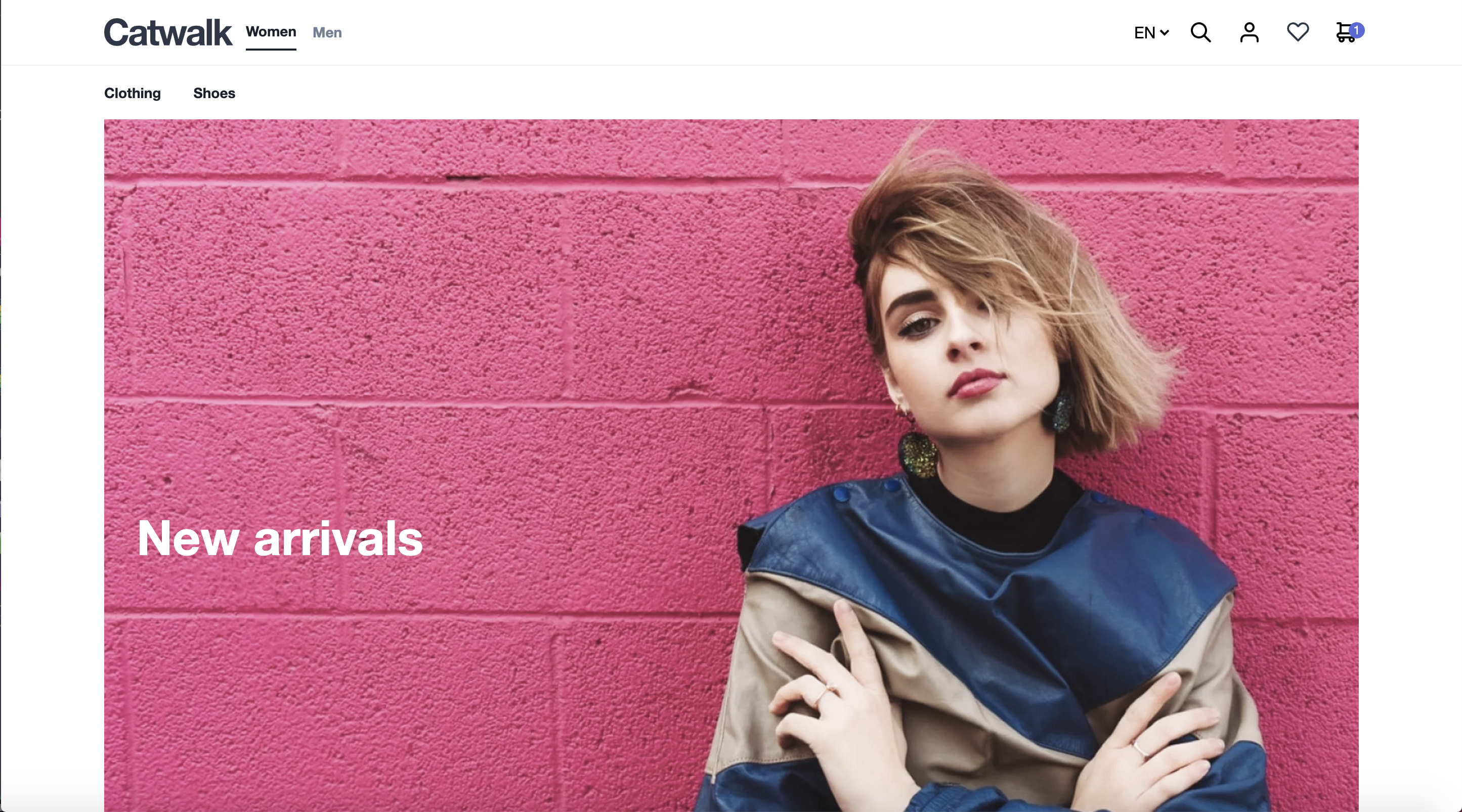 | 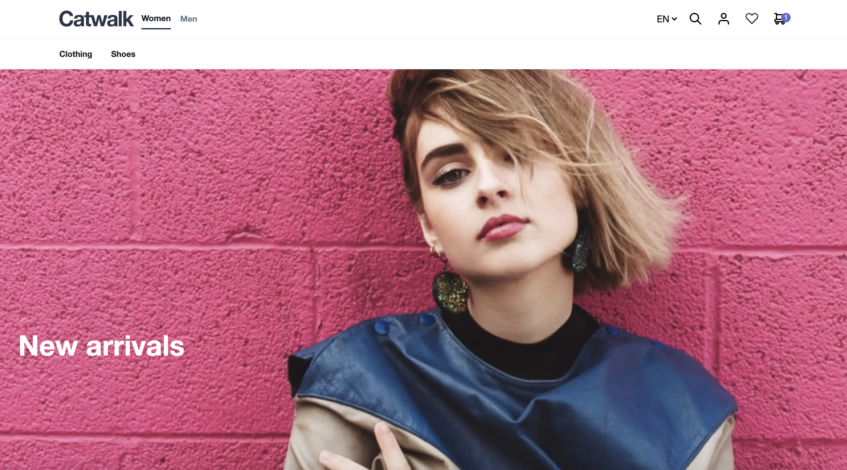 |
## Build a full-width component
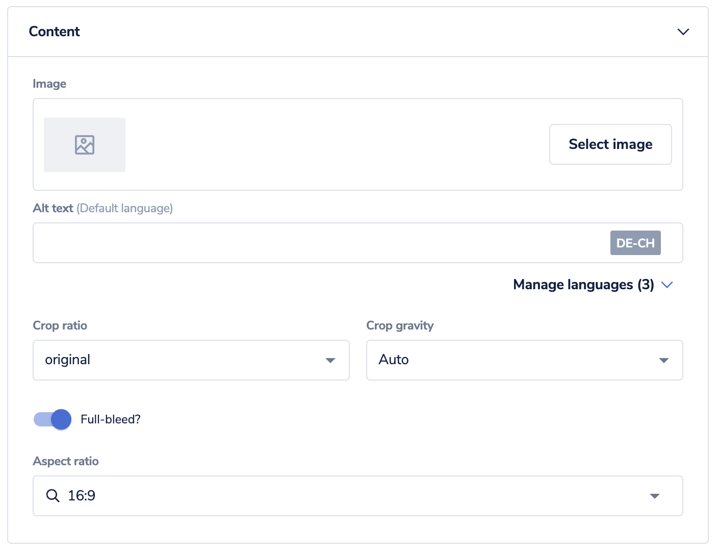
As always, we start with the schema. We will create a text field and a toggle so that Studio users can turn our full-bleed image feature on and off. We have also configured a maximum use per page; as a result, you can add the image only once to a page.
```json title="schema.json"
{
"tasticType": "frontastic/examples/hero",
"name": "Hero",
"icon": "image",
"category": "content",
"maxUsePerPage": 1,
"schema": [
{
"name": "Content",
"fields": [
{
"label": "Image",
"field": "image",
"type": "media"
},
{
"label": "Full-bleed?",
"field": "isFullBleed",
"type": "boolean",
"required": true,
"default": true
},
{
"label": "Aspect ratio",
"field": "aspect",
"type": "enum",
"default": "16/9",
"values": [
{
"value": "original",
"name": "Original"
},
{
"value": "16/9",
"name": "16:9"
},
{
"value": "4/3",
"name": "4:3"
},
{
"value": "21/9",
"name": "21:9"
}
]
}
]
}
]
}
```
Upload this schema to the Studio.
Next, we need to create our `index.tsx` file to receive the information from the schema.
```javascript title="index.tsx"
import React from 'react';
import Hero from 'components/Hero';
const HeroTastic = ({ data }) => {
return ;
};
export default HeroTastic;
```
Then, we create a wrapper component and add it to the following location: `frontend/components/HOC/`. This simple React Component makes sure its contents (the children) fill up the whole horizontal viewport space. To accomplish this, we use a [little CSS trick](https://piccalil.li/tutorial/creating-a-full-bleed-css-utility/).
```javascript title="FullPageWidthWrapper.jsx"
import React from 'react';
export default function FullPageWidthWrapper({ children, className = '' }) {
return (
{children}
);
}
```
We can now use the wrapper to wrap the contents of our component if the users of the Studio choose to do so using the toggle. We do this in the `index.tsx` of the component.
```typescript title="index.tsx"
import React from 'react'
import Image from 'frontastic/lib/image';
import FullPageWidthWrapper from '../Layout/FullPageWidthWrapper'
const Hero = ({ image, aspect, isFullBleed }) => {
const aspectClass = {
'original': '',
'16/9': 'pb-16/9',
'4/3': 'pb-4/3',
'21/9': 'pb-21/9',
}
const calculateAspectStyle = (aspect, img) => {
if (aspect === 'original' && img) {
return { paddingBottom: '${(img.media.height / img.media.width) * 100}%'}
}
return {}
}
const content = (
)
if (isFullBleed) {
return {content}
}
return content
}
export default Hero
```
And that's it. When you add this component to a page version in the Studio, you can select the image and if it is full-bleed:
If you add another Frontend component to the same layout element, it could cause your layout to break. Either keep it in a separate layout element or update your CSS to stop this from happening.
## Related pages
- [Area overview page with navigation](/frontend-development.md)
- [Previous page: Creating a redirect component](/frontend-development/client-side-redirect-component.md)
- [Next page: How to slice a commerce site into components](/frontend-development/how-to-slice-a-commerce-site-into-components.md)
- [Search documentation and API specs](/search.md)