Author the InStore POS theme with palette tokens, MUI component overrides, responsive layout tokens, and POS-specific style hooks.
This page explains what goes in a theme and how to shape the POS with it. Two companion pages cover the mechanics.
- Run POS API requests: set the base host, project, and tenant, get a token, and run calls.
- Theme API reference: the
GET,PUT, andPATCHtheme endpoints, with request/response examples.
Prerequisites
- A Module Federation host running the standard InStore POS setup.
- MUI v7 (
@mui/material ^7.3.7) in the host. Payloads mirror the MUI 7ThemeOptionsshapes. If you have themed MUI 5 or 6 before, thepalette,typography,components,breakpoints,spacing, andshapefields are structurally compatible. - To deliver a theme through the API, you need an InStore access token and an HTTP client. To set up authentication and send requests, see Run POS API requests.
MUI theming concepts
The InStore POS theme uses the public MUI theme shape plus a small number of InStore-specific fields. These MUI concepts appear throughout the payload:
- Theme: the object holding styling decisions such as palette, typography, spacing, breakpoints, shape, and per-component overrides.
- Palette: named color tokens such as
primary.main,secondary.main,text.primary, andbackground.default. - Token: a named value in the theme that other rules reference instead of hard-coding a literal value.
- Slot: a named structural part inside a component, such as
root,label,startIcon, orpaper. styleOverrides: per-slot style rules for a component.defaultProps: default React props applied to each instance of a component.variants: conditional style blocks that apply when a component matches a prop orclassName.- State class: a class MUI adds for interaction state, such as
Mui-disabled,Mui-focused, orMui-selected.
InStore-specific theme fields
The terms below are specific to how the InStore POS and its Theming API work.
- Bundled default theme: the theme that the InStore POS ships with and uses when no API theme is set. It has the same shape as the API payload, so everything on this page applies to it. Your tenant's look is driven by the theme you store through the Theming API.
customTokens: POS-specific responsive layout flags that aren't part of the MUI stock theme (header/footer visibility, sidebar structure). Documented in Responsive layout tokens.__fn:ownerState: a JSON discriminator used insidestyleOverridesto express the MUI callback-form conditional styling without sending a JavaScript function. The API accepts JSON payloads only, and accepting arbitrary function strings would be an unacceptable code-injection vector, so the MUI(ownerState) => ({...})form is replaced by a strictly validated{ "__fn": "ownerState", "cases": { ... } }shape. Only"ownerState"is allowed; any other discriminator is rejected with a 400. To define conditional component styles with the supported JSON shape, see The ownerState escape hatch.
Slots, styleOverrides, variants, and defaultProps
These are the main building blocks for overriding a component:
defaultPropsset baseline props for each instance of a component.styleOverridestarget a component slot, such ascomponents.MuiButton.styleOverrides.root.variantsapply only when props match. The POS uses class-name variants such as{ "props": { "className": "instore-primary-action" }, "style": { ... } }to target a specific POS surface.
styleOverrides when a change should apply to every instance of a component. Use a variants entry or nested instore-* selector when a change should apply to one POS surface.How overrides compose
Theme rules compose from general to specific:
- Palette, typography, spacing, shape, and breakpoints establish the token values.
defaultPropsset baseline component behavior.styleOverridesstyle each component slot.variantsapply when a prop or class-name matcher matches.- State classes such as
Mui-disabledandMui-selectedapply interaction-state styles.
When two rules style the same property, CSS specificity decides which rule has precedence. A class-name variant or state-specific selector usually has precedence over a bare slot rule.
How themes work
components.MuiX, which are replaced atomically. For more information, see Leaf merge versus atomic component replacement.Conceptually, treat the bundled default theme as the baseline your tenant theme overlays. The theme you store through the Theming API is what's applied. Any value it doesn't set falls back to the bundled default.
useTheme. The /theme API applies to non-core POS functionality such as Cart, Catalog, Transactions, and Receipt reprint. If you use an older modular-store host, see Override product module styling to theme core functionality such as payment, refund, cash management, and device management.

Leaf merge versus atomic component replacement
Your tenant theme overlays the bundled default rather than replacing it wholesale. It follows two different rules:
- Most fields merge at the leaf. For
palette,typography,spacing,shape, andbreakpoints, only the individual values you send change. Their siblings keep the bundled default. For example, settingpalette.primary.mainleavespalette.secondaryexactly as it was. - Each
components.MuiXblock is replaced as a whole. When your payload includes a component, such ascomponents.MuiButton, that entire block (defaultProps, everystyleOverridesslot, and everyvariantsentry) replaces the storedMuiButtondefinition. Components you don't mention are untouched. The component you do mention is taken exactly as you send it, with nothing merged in from the previous block.
PUT and PATCH. Even a PATCH, which preserves the top-level fields you omit, replaces any components.MuiX block you include wholesale.components.MuiX block is taken whole. Resend the entire block under both PUT and PATCH.GET /theme, find the component block, edit it in place, and send the whole block back.MuiButton like this:{
"components": {
"MuiButton": {
"defaultProps": { "disableElevation": true },
"variants": [
{
"props": { "className": "instore-primary-action" },
"style": { "backgroundColor": "primary.main" }
},
{
"props": { "className": "instore-search-scan-btn" },
"style": { "backgroundColor": "secondary.main" }
}
]
}
}
}
PATCH MuiButton with just that one variant:{
"components": {
"MuiButton": {
"variants": [
{
"props": { "className": "instore-primary-action" },
"style": { "backgroundColor": "tertiary.main" }
}
]
}
}
}
disableElevation default prop and the instore-search-scan-btn variant are now gone:{
"components": {
"MuiButton": {
"variants": [
{
"props": { "className": "instore-primary-action" },
"style": { "backgroundColor": "tertiary.main" }
}
]
}
}
}
disableElevation and the scan-button variant in the same payload.Atomic replacement instead of deep-merge
variants. Deep-merging that structure is ambiguous and fragile.variants arrays. A silent merge could also keep default rules you never meant to preserve.That can produce conflicting or duplicated styles. It can also create specificity battles that are hard to debug.
Atomic replacement keeps each component predictable and self-contained. The block you send is exactly what applies.
What you author is what renders, without leftover rules from the bundled theme. The cost is resending the full block.
Default and POS starter themes
You don't author a theme from a blank page. Two starting points are available:
- Default theme: the bundled look the POS falls back to when no theme is stored. It resembles the legacy InStore look. Sending an empty body to
PUT /themeresets the tenant to this look. - POS starter theme: an industry-typical configuration that reflects how most retailers expect a POS to look. Load it with
PUT /themeand then adjust it withPATCHto match your brand.
PUT of the provided payload; from there, every change is a small PATCH. To review the request and empty-body behavior, see PUT /theme.Back up your theme payloads
The InStore POS stores only the currently active theme. It keeps no server-side version history or change log. commercetools cannot recreate a configuration you overwrite or lose. Build a simple backup habit:
- Save every payload. Keep your
PUTandPATCHrequest bodies and theGETresponses in your own version control or file store. These are also how you maintain alternative "modes" (seasonal, per-brand). The server keeps only one, so you track the rest. - Read before you write. Run
GET /themebefore each change. Use its response as the base for your next request so you always edit the live state. - Validate generated payloads. If you use generated or assisted theme payloads, review the JSON before applying it. Confirm that
components.MuiXblocks are complete and that values follow the validation rules.
The theme payload
ThemeOptions shape plus a small set of InStore-specific fields. Standard MUI theming knowledge therefore applies directly. Three concepts recur throughout:- Palette: named color tokens referenced as strings (for example,
'primary.main') elsewhere in the theme. - Components: per-MUI-component overrides; each accepts
defaultProps,styleOverrides, andvariants. customTokens: POS-specific responsive flags for layout, not part of stock MUI.
Customize MUI component overrides
components, you key by MUI component name (MuiButton, MuiAppBar, MuiPaper, and so on) and provide any combination of three sub-shapes:defaultProps: sets the default React props for every instance of that component. Useful for global decisions such asdisableElevation: trueon every button.styleOverrides: keyed by component slot (the named structural parts MUI exposes; for example,MuiButtonexposesroot,label,startIcon,endIcon). Values are CSS-in-JS objects. Each MUI component documents its own slot list. See the component pages in the MUI 7 docs.variants: conditional style blocks that activate when a prop matcher matches. The POS uses this heavily withclassNamematchers like{ props: { className: 'instore-primary-action' }, style: { ... } }to apply a named visual variant only when a component is tagged with that class.
{
  "components": {
    "MuiButton": {
      "defaultProps": {
        "disableElevation": true
      },
      "styleOverrides": {
        "root": {
          "borderRadius": "8px",
          "textTransform": "none",
          "&:hover": { "boxShadow": "none" }
        }
      },
      "variants": [
        {
          "props": { "className": "instore-primary-action" },
          "style": {
            "backgroundColor": "primary.main",
            "color": "primary.contrastText",
            "height": 68,
            "fontSize": 20
          }
        }
      ]
    }
  }
}
sx. That's what lets your overrides reference palette tokens by string instead of repeating hex values.Reference palette tokens in component overrides
styleOverrides, variants[].style, and __fn cases, reference a palette token by string and the runtime resolves it against the active palette:- Brand colors:
'primary.main','primary.contrastText','secondary.main','tertiary.main'. - Text and surfaces:
'text.primary','text.secondary','background.default','background.paper','divider','common.white','common.black'. - Semantic states:
'action.hover','action.disabledBackground','action.disabled'.
light, dark, and contrastText from main for its standard colors (primary, secondary, error, warning, info, success), so you can reference 'primary.dark' for a hover state even if your palette only sets primary.main. The custom tertiary color is not auto-derived. Define any shade you reference (tertiary.dark, tertiary.contrastText) explicitly in the palette, as in the worked example below.{
"components": {
"MuiAppBar": {
"styleOverrides": {
"root": {
"backgroundColor": "primary.main",
"color": "primary.contrastText"
}
}
}
}
}
palette.primary.main, and every override that references it updates together. Re-branding becomes a one-line edit instead of a search-and-replace across scattered hex values. The bundled POS theme references tokens throughout for exactly this reason.({ theme }) => ({ ... }) callback, so the token-string form is the API-safe way to stay palette-aware. For prop-conditional styles, use the ownerState escape hatch. Its case styles resolve as sx too, so they can reference tokens.sx, numeric spacing and radius are theme multiples, not pixels: "borderRadius": 8 becomes 8 × the theme's base radius, and "padding": 2 is 2 × the 8px spacing unit. For an exact pixel value, use a unit string: "borderRadius": "8px". Any value can also be a responsive map ({ "xs": ..., "md": ... }).The ownerState escape hatch
styleOverrides, ({ ownerState }) => ({ ... }), which is a JavaScript function, and JSON cannot carry functions.__fn escape hatch is a small domain-specific language (DSL) that encodes that function as plain data so it survives the round trip through the API. Instead of a function body, you send a discriminator ("__fn": "ownerState") and a cases map; when the InStore POS applies the theme, it reconstructs the equivalent callback from that data. Sending an executable function string instead would be a code-injection vector, so the schema accepts only this fixed shape: "ownerState" is the only discriminator, and any other value is rejected with a 400.prop=value test against the component's ownerState. The runtime applies the first matching case, falling back to the default key, then resolves the result as sx, so a case can reference palette tokens such as 'primary.main', just like any other override.{
components: {
MuiButton: {
styleOverrides: {
root: ({ ownerState, theme }) => {
if (ownerState.size === 'small') return { padding: '4px 8px' };
if (ownerState.color === 'primary')
return {
backgroundColor: theme.palette.primary.main,
color: theme.palette.primary.contrastText,
};
return { padding: '6px 16px' };
},
},
},
},
}
{
  "components": {
    "MuiButton": {
      "styleOverrides": {
        "root": {
          "__fn": "ownerState",
          "cases": {
            "size=small": { "padding": "4px 8px" },
            "color=primary": {
              "backgroundColor": "primary.main",
              "color": "primary.contrastText"
            },
            "default": { "padding": "6px 16px" }
          }
        }
      }
    }
  }
}
ownerState property (the part before =) against a value (the part after). Only { "__fn": "ownerState", "cases": { ... } } is accepted. To check the schema rules that reject unsupported function payloads, see Validation and errors.Responsive layout tokens
customTokens controls non-MUI layout decisions: header/footer visibility and sidebar structure. Every token accepts either a bare value that applies at every viewport size, or a responsive value that varies per breakpoint.Breakpoints in brief
xs, sm, md, lg, xl) defined by minimum widths. The default thresholds are xs: 0, sm: 600, md: 900, lg: 1200, xl: 1536 (pixels). You can override these via the top-level breakpoints field in your theme; customTokens and the MUI component styling both read from the same definitions, so a single change propagates everywhere.Bare value vs. responsive value
- Bare value (
true,5,'inline'): applies at every viewport. Use this when the layout decision is genuinely not viewport-dependent. Shorter, easier to read, and cheaper at runtime. - Responsive value (
{ xs?, sm?, md?, lg?, xl? }): applies a different value per breakpoint. Use this when the same layout needs different chrome on a phone, device, or POS terminal (for example, drilldown sidebars on small screens and inline sidebars on large ones). The runtime resolves from the current breakpoint downward: if the active breakpoint islgand you only setxsandmd, the runtime returns themdvalue. If no key matches at or below the current breakpoint, it falls back to the bundled default.
lg with only xs and md set resolves to md, and nothing at or below falls back to the bundled default.useMediaQuery hook and the sx prop's per-breakpoint shorthand), see the MUI 7 breakpoints reference.Field reference
| Field | Attributes | Type | Description | Example |
|---|---|---|---|---|
layout | Object | Visibility flags for the top-level chrome. | ||
headerVisible | Boolean | ResponsiveValue | Whether the top header bar renders. | false or { "xs": false, "md": true } | |
mobileFooter | Boolean | ResponsiveValue | Whether the mobile status or footer bar renders. | { "xs": true, "md": false } | |
desktopFooter | Boolean | ResponsiveValue | Whether the desktop status bar renders. | { "xs": false, "md": true } | |
sidebar | Object | Sidebar structure. | ||
showLogo | Boolean | ResponsiveValue | Whether the logo renders in the sidebar header. | true | |
showCollapseButton | Boolean | ResponsiveValue | Whether the collapse and expand toggle renders. | { "xs": true, "md": false } |
A bare scalar applies at every viewport:
{ "customTokens": { "layout": { "headerVisible": false } } }
A responsive boolean map gives different behavior per breakpoint:
{
  "customTokens": {
    "sidebar": { "showCollapseButton": { "xs": true, "md": false } }
  }
}
Apply the theme across the InStore POS
The InStore POS fetches the theme from the Theming API at bootstrap and applies it automatically. A standard integration never needs to apply the theme from code. The active theme applies to non-core POS functionality such as Cart, Catalog, Transactions, and Receipt reprint.
Inspect and override a specific element
Use Chrome DevTools to find what to target. Each element exposes four signals you can read straight from its class list.
Class-name conventions
instore-*: POS style hooks. Target via a nested class selector inside astyleOverridesslot ("&.instore-...") or avariantsentry with aclassNamematcher. See the POS style reference for the full inventory and the exact slot per hook..MuiX-{slot}: MUI structural classes. The suffix (root,label,startIcon, ...) is the key you use understyleOverrides. Slot inventories live in the MUI 7 component docs..Mui-{state}: interaction states (Mui-disabled,Mui-focused,Mui-selected). Nest under&insidestyleOverrides:"&.Mui-disabled": { "opacity": 0.5 }..MuiX-{variantOrColor}: prop-driven classes (MuiButton-contained,MuiButton-colorPrimary). Target with nested selectors, or use the ownerState escape hatch for complex matching.
Inspection workflow
-
Open the POS in a desktop browser, right-click the element you want to change, and choose Inspect.

-
Read the element's class list to identify the MUI component (
.MuiButton-roottoMuiButton), the slot (label,startIcon, and so on, usuallyroot), the variant/color props (MuiButton-contained), and anyinstore-*hook.
instore-.-
Decide whether the rule is global or specific. Global rules go in
components.MuiX.styleOverrides; per-element rules go incomponents.MuiX.variantswith aclassNamematcher (preferred when aninstore-*hook exists). -
Write the override and apply it with a
PATCH /themerequest. It deep-merges your change into the stored theme, so the rest of your configuration is preserved. AvoidPUTfor incremental edits. It replaces the whole theme and unsets every field you omit. Then reload the POS. -
Reload the page and re-inspect. The Styles panel shows whether your rule took effect or was overridden by a more specific selector.

-
If your rule is crossed out, raise specificity or move the rule into
variants.
Worked example: recolor the primary action button
MuiButton-root MuiButton-contained MuiButton-containedPrimary instore-primary-action. You want the checkout call-to-action button green, not every contained button. Define the green once as a palette token (tertiary) and reference it from the instore-primary-action variant; the Mui-disabled state then draws from the MUI semantic action tokens rather than another hard-coded gray.{
"palette": {
"tertiary": {
"main": "#708238",
"dark": "#5D6D2F",
"contrastText": "#ffffff"
}
},
"components": {
"MuiButton": {
"styleOverrides": {
"root": {
"&.MuiButton-containedPrimary.Mui-disabled, &.MuiButton-primary.Mui-disabled": {
"backgroundColor": "primary.main",
"color": "primary.contrastText",
"opacity": 0.5
},
"&.MuiButton-containedSecondary.Mui-disabled, &.MuiButton-secondary.Mui-disabled": {
"backgroundColor": "secondary.main",
"color": "secondary.contrastText",
"opacity": 0.5
},
"&.MuiButton-contained.colorTertiary": {
"backgroundColor": "tertiary.main",
"color": "tertiary.contrastText"
},
"&.MuiButton-contained.colorTertiary.Mui-disabled, &.colorTertiary.Mui-disabled": {
"backgroundColor": "tertiary.main",
"color": "tertiary.contrastText",
"opacity": 0.5
},
"&.Mui-focusVisible": {
"outline": "2px solid #90caf9",
"outlineOffset": "2px"
}
}
},
"variants": [
{
"props": {
"className": "instore-primary-action"
},
"style": {
"backgroundColor": "tertiary.main",
"color": "tertiary.contrastText",
"height": "68px",
"borderRadius": "10px",
"fontSize": "20px",
"lineHeight": 1,
"paddingLeft": "42px",
"paddingRight": "42px",
"paddingTop": "13px",
"paddingBottom": "13px",
"&:hover": {
"backgroundColor": "tertiary.dark"
},
"&:active": {
"backgroundColor": "#4A571F"
},
"&.Mui-focusVisible": {
"outline": "2px solid #90caf9",
"outlineOffset": "2px"
},
"&.instore-primary-action.Mui-disabled, &.instore-primary-action:disabled": {
"backgroundColor": "#D3D1CA",
"color": "#444444",
"opacity": 1
}
}
}
]
}
}
}
PATCH /theme request, not PUT. The payload above is a partial theme (only palette.primary and components.MuiButton), so PATCH deep-merges it onto your stored theme and leaves everything else intact, whereas PUT would unset every field you did not send. The example sends the whole MuiButton block on purpose. PATCH replaces a components.MuiX block atomically (it is not deep-merged), so any slot you omit here would be dropped. Then reload and re-inspect. The Styles panel now shows the new backgroundColor. Because the variant references tertiary.*, you can re-tune the green later by editing palette.tertiary alone. If the rule does not take effect, check that no more-specific rule (for example, a global .MuiButton-containedPrimary selector elsewhere) is winning the cascade.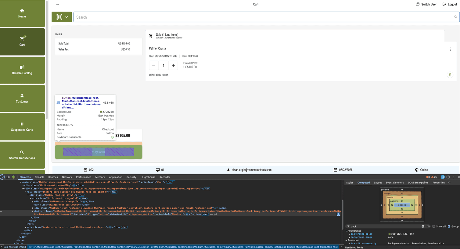
variants with a class matcher over deeply nested &.MuiButton-... selectors. Variants are clearer to read and survive future MUI minor-version changes that may rename internal classes.Override hierarchy in practice
components.MuiButton.defaultProps and styleOverrides (which apply to every button), and finally by a class-targeted variants entry that activates only for buttons tagged instore-primary-action.{
"palette": {
"primary": { "main": "#15375C", "contrastText": "#ffffff" }
},
"components": {
"MuiButton": {
"defaultProps": { "disableElevation": true },
"styleOverrides": {
"root": {
"borderRadius": "8px",
"textTransform": "none"
}
},
"variants": [
{
"props": { "className": "instore-primary-action" },
"style": {
"backgroundColor": "primary.main",
"color": "primary.contrastText",
"height": 68,
"fontSize": 20,
"&:hover": { "backgroundColor": "primary.dark" },
"&.Mui-disabled": {
"backgroundColor": "action.disabledBackground",
"color": "action.disabled"
}
}
}
]
}
}
}
<Button> in the POS picks up layers 1 to 3. Only buttons rendered with className="instore-primary-action" additionally pick up layer 4, which is how the bundled default theme establishes the recognizable checkout call-to-action button. Because the variant references primary.main (and the derived primary.dark for hover) rather than one-off hex, re-branding that button is a single edit to palette.primary. The button, its hover, and every other primary-colored surface move together. Leave the structural height and fontSize alone unless you specifically want a different shape.Common style hooks
instore-* class hooks: on the header, sidebar, search bar, cart, totals money box, dialogs, and more. Target a hook from your own overrides by re-declaring the matching rule on the appropriate MUI component.styleOverrides slot or variants entry, and the properties you typically change. That appendix also covers the cart line-item card and its rows, the totals money box, the camera scanner, and the behavior and layout toggles.{
"components": {
"MuiAppBar": {
"variants": [
{
"props": { "className": "instore-header-bar" },
"style": {
"backgroundColor": "background.paper",
"color": "text.primary",
"boxShadow": "0 1px 2px rgba(0,0,0,0.05)"
}
}
]
}
}
}
Troubleshooting
- Theme not applied to federated modules? Confirm the theme has been published for the tenant and location you are running against, then reload the POS.
PATCHdidn't merge insideMuiButton? The block under eachcomponents.MuiXis atomic. Re-send the full block to keep existing entries.- 400 with a
SafeCssStringerror? Search your payload for<,>, backticks, or stray newlines inside string values. To review the rejected character rules, see Validation and errors. - Theme persisted but UI unchanged? Reload the POS app. Themes fetch at bootstrap.