Learn about using layout components to structure content within your customizations.
At commercetools, visual hierarchy is one of our core design heuristics. To ensure good visual hierarchy of your pages, you should utilize spacing and layouts.
Layouts are the foundation for your page content structure. They provide the necessary flexibility to build beautiful and accessible user interfaces while adding constraints to help you create a familiar user experience.
For example, implementing a details page might require rendering form elements and additional meta information, while a list page with a large table requires a different layout. Layouts ensure that your page content has the correct hierarchy and structure for the best user experience for the given use case.
21.22.0 onwards.Layout types
A layout sets the container's minimum and maximum width and position on the page. To support various page content requirements, we provide the following layout types:
| Layout type | Use case |
|---|---|
| Narrow | Simple forms, collapsible panels, and cards. |
| Wide (single column) | Large forms or tables with few columns. |
| Wide (Two columns 1:1) | Content grouped together to save vertical space. |
| Wide (Two columns 2:1) | Wider tables and some meta information. |
| Full | Horizontal reading flow such as large tables. |
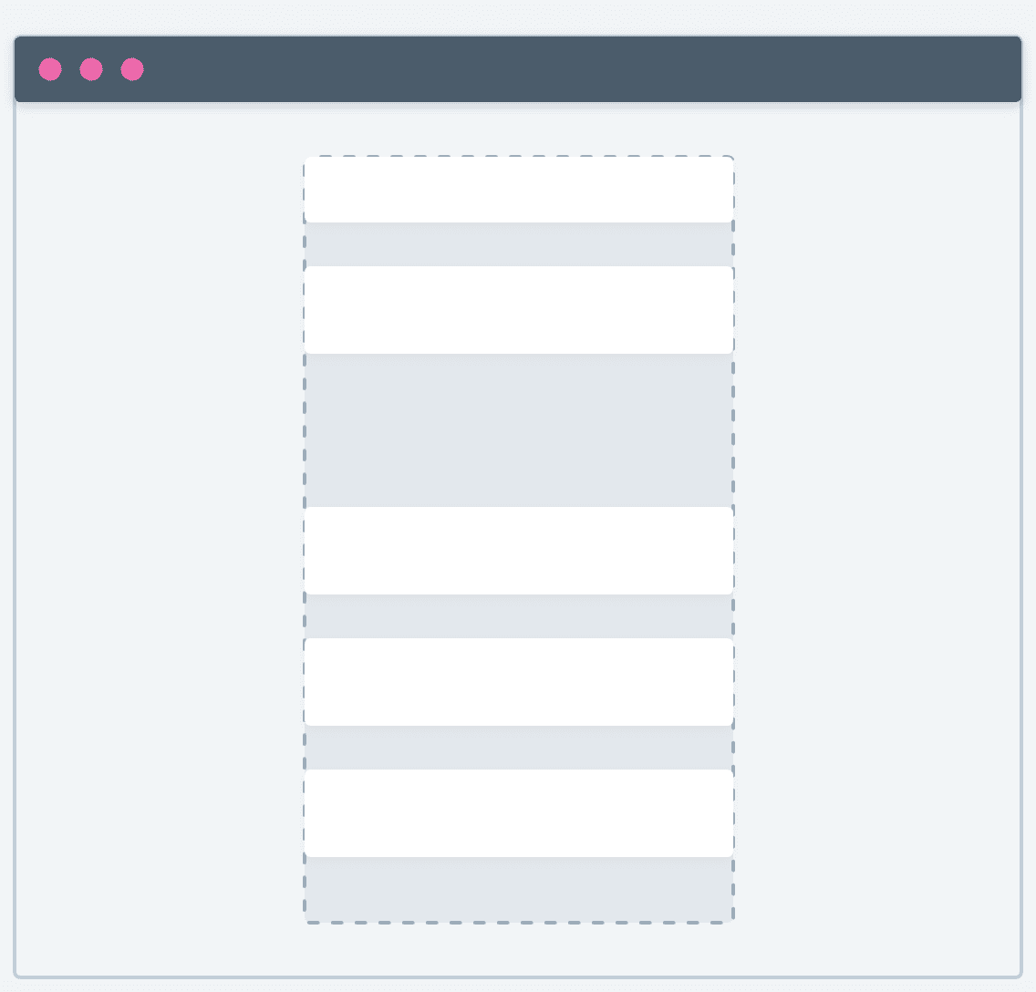
Narrow
A narrow layout consists of a single-column with a constrained width size.
<PageContentNarrow> component.import { PageContentNarrow } from '@commercetools-frontend/application-components';
const ChannelsDetails = () => {
// ...
return (
<PageContentNarrow>
<Spacings.Stack>
<div>Title</div>
<ChannelsForm />
</Spacings.Stack>
</PageContentNarrow>
);
};
Best practices
- Use a narrow layout for simple forms where form fields must span across the available width (
horizontalConstraint: scale). - Avoid a narrow layout for complex forms and tables.
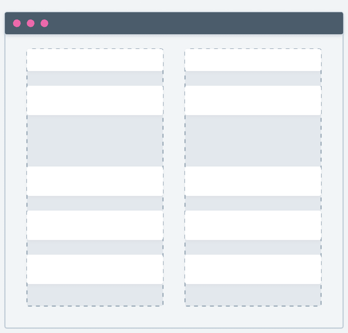
Wide (single column)
A wide layout consists of a single column with a constrained width size, wider than a narrow layout.
<PageContentWide> component.import { PageContentWide } from '@commercetools-frontend/application-components';
const ChannelsDetails = () => {
// ...
return (
<PageContentWide>
<Spacings.Stack>
<div>Title</div>
<ChannelsForm />
</Spacings.Stack>
</PageContentWide>
);
};
Best practices
- Use a wide layout for content where more space is necessary but does not require the full page width.
- Depending on the type of content, consider also using a
horizontalConstraint: 15to limit the width, for example, with form fields. - Avoid a wide layout for large tables.
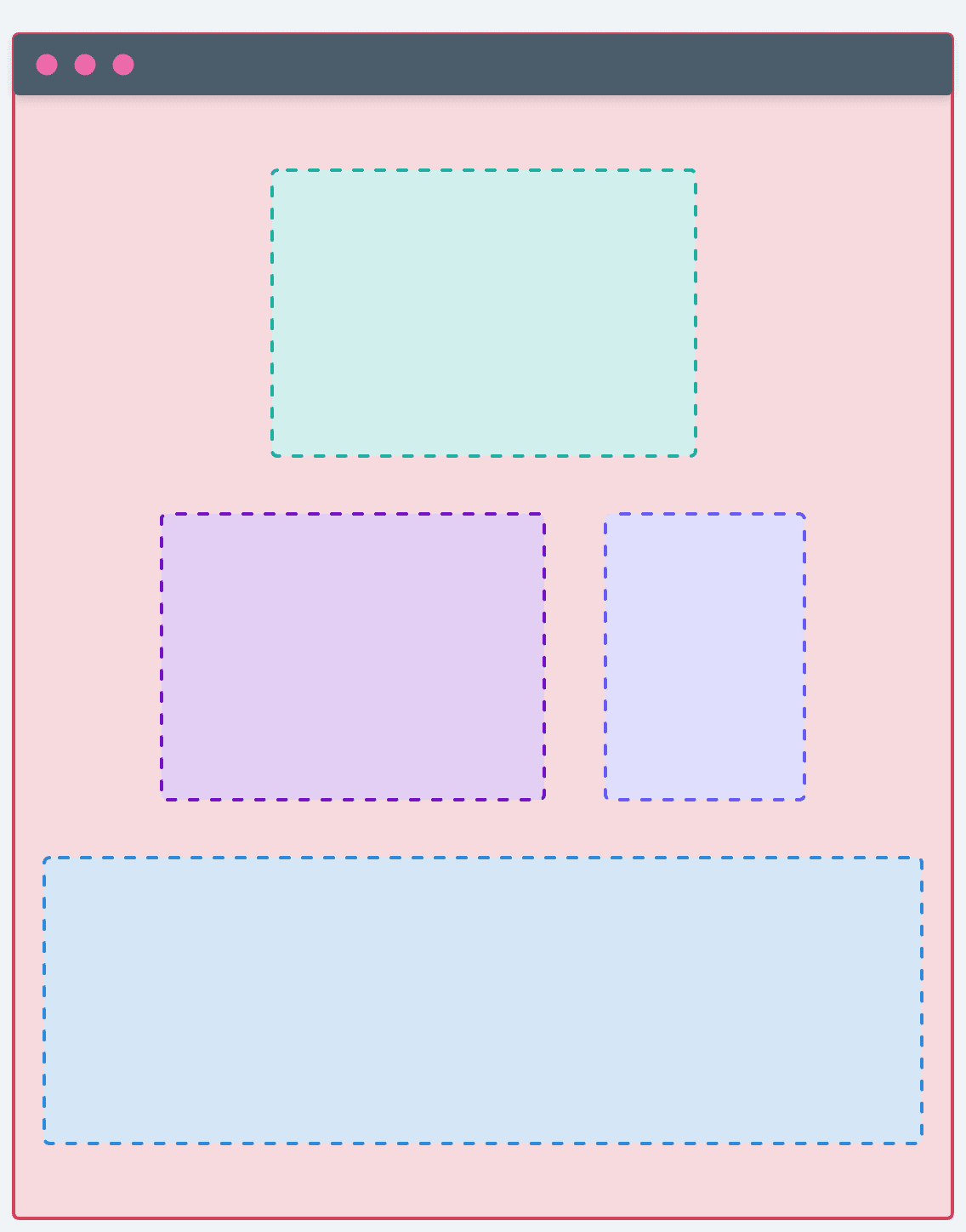
Wide (two columns: 1/1)
This variation of the wide layout consists of two columns of equal sizes.
<PageContentWide> component with the columns property set to 1/1.import { PageContentWide } from '@commercetools-frontend/application-components';
const ChannelsDetails = () => {
// ...
return (
<PageContentWide columns="1/1">
<div>Left side</div>
<div>Right side</div>
</PageContentWide>
);
};
Best practices
- Use a wide layout with two columns for displaying information next to each other to save vertical space.
- Group the content of each column to indicate to the user that they should view the content vertically.
- Avoid horizontal constraints. Instead, let the content span across the available width.
- Avoid this layout for tables and forms.
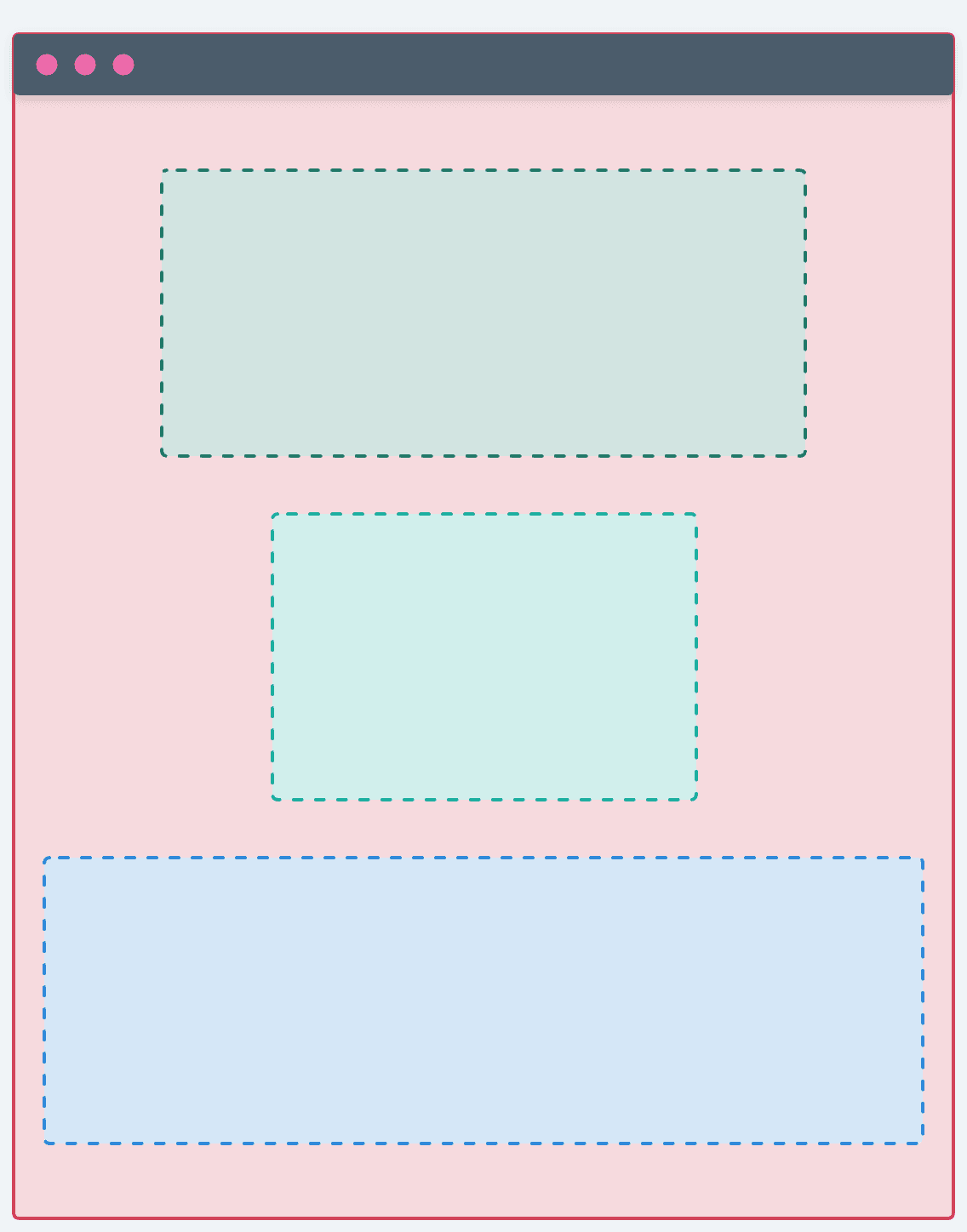
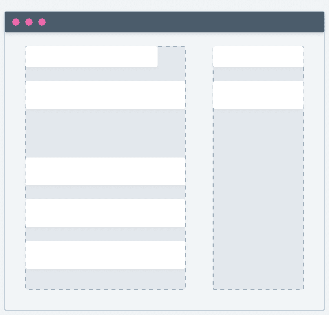
Wide (two columns: 2/1)
This variation of the wide layout consists of two columns of different sizes, with the left column being wider than the right.
<PageContentWide> component with the columns property set to 2/1.import { PageContentWide } from '@commercetools-frontend/application-components';
const ChannelsDetails = () => {
// ...
return (
<PageContentWide columns="2/1">
<Spacings.Stack>
<ChannelsForm />
</Spacings.Stack>
<Spacings.Stack>
<div>Meta info</div>
</Spacings.Stack>
</PageContentWide>
);
};
Best practices
- Use the left column to render forms where form fields must span across the available width (
horizontalConstraint: scale). - Use the right column to display general information or links about the page, such as meta dates or links to other resources, because the column is sticky on scroll.
- Avoid this layout for tables.
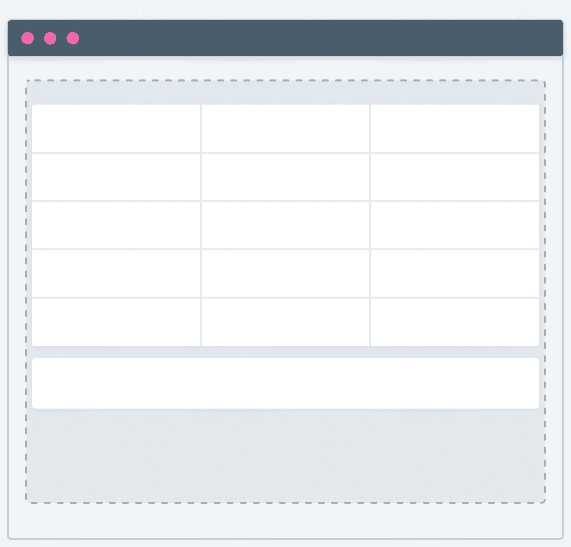
Full
A full layout consists of a container that spans across the width of the page.
<PageContentFull> component.import { PageContentFull } from '@commercetools-frontend/application-components';
const Channels = () => {
// ...
return (
<PageContentFull>
<ChannelsTable />
</PageContentFull>
);
};
Best practices
- Group the content so that the reading flow is clear and the user can scan through the page easily.
- Use this layout for horizontally grouped content.
- Avoid using this layout for forms.
Layout combinations
You can combine up to two different layout types on the same page. We support the following layout combinations:
-
Narrow + wide (single column)

-
Narrow + full

-
Wide (two columns: 1/1) + wide

-
Wide (two columns: 2/1) + wide

-
Wide (two columns: 2/1) + wide (two columns: 1/1) + full

-
Wide + full + wide (two columns: 2/1)

Limitations
A single page can contain a maximum of two layout types.
For example, the following layout combinations won't work: