Frontend components are the most important interaction point between developers and business users. Their schema defines how business users will be able to use your components. In the best case, you'll discuss the components upfront with a Product Manager based on the expected usage during later project stages. But as this often isn't the case and the business users are only involved in later project stages, we want to provide you with some ideas and guidance on slicing a commerce site into components.
There are 3 important questions to answer to understand the trade-offs:
- What do business users want to change on a commerce site?
- How flexible should the components be for business users?
- How can you build resilient components?
All are pretty hard to answer and should be a team decision (or at least feedback from a Product Manager). This article will give you some tips on how you could go about finding the answers.

So now we know what we can break it into, what should be configurable within the Studio? Well, that's totally up to your team. Let's look at some options.
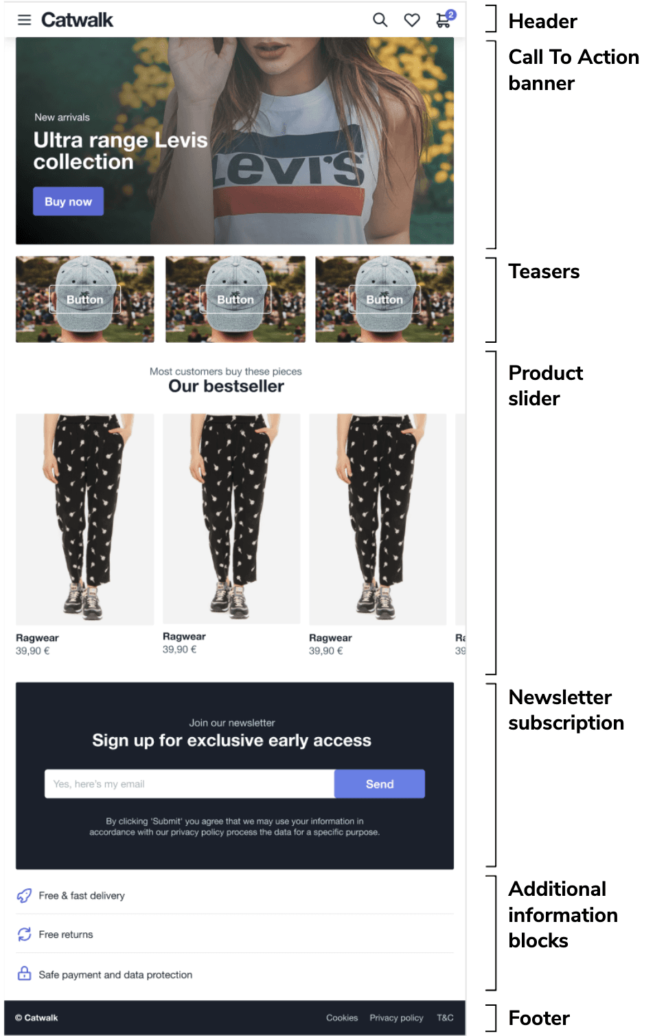
Header

Call To Action banner


Product slider

You could have 1 Frontend component with configuration options for a title and a subtitle, along with products. But you could also have 1 Frontend component with just the product slider that contains the actual products (and so no configuration options) and then use a separate generic Markdown component to allow for the title and subtitle. This gives the business user a lot more flexibility regarding text placement, but this can also mess up the layout. Spacings are often a problem here because unifying spacing gets more complex the smaller your components are. We've seen some customers introducing extra spacing components so that business users can work on these issues. But the trade-offs really depend on the flexibility your business users want to have so that there's no clear answer for this Frontend component.
Newsletter

Additional information blocks

Footer

Other tips
When it comes to flexibility in general, you can create a native HTML component that allows a business user to enter any blob of HTML and render this. As a developer, you'll know that your site will probably break as soon as you do this if business users aren't used to writing HTML.
Regarding configuration options, the trade-offs mightn't always be as obvious. For example, should you allow business users to specify exact color values, or could this mean that it doesn't follow brand guidelines or the corporate identity of your commerce site? A selection between "primary" and "secondary" might make more sense, while the exact color values are read from your theme configuration.
Many developers are tempted to create too many configuration options "because they can" and save themselves work in the future. But are they really necessary? Try to create configuration options for things that have been requested to be configured. If you find in the future that another configuration option is needed, it's easier to add it in than remove ones that are an issue. Plus, testing frontend components with hundreds of potential variants can be pretty challenging. Start with the minimum (maybe even no) configuration options, and see how it's being used before making it available.
When it comes to splitting a commerce site into components, it can seem like a daunting task, especially when trying to account for all the different options for business users. Try to think about what a business user needs or wants to configure. But always put resilience over too many configurations or what should be adapted.